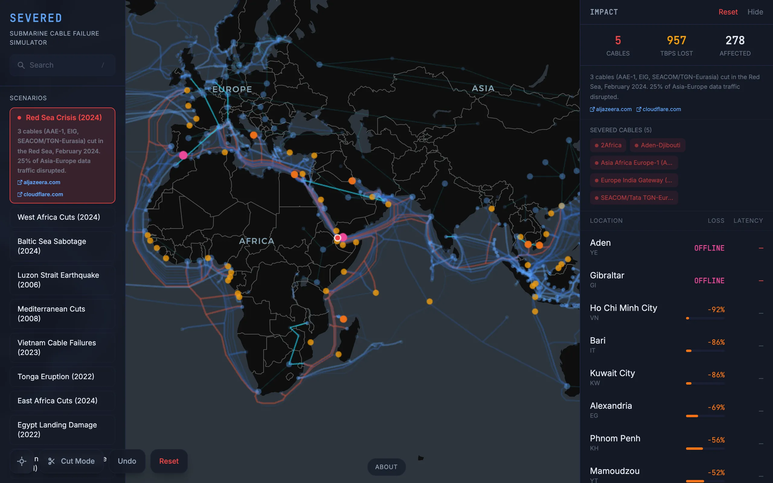
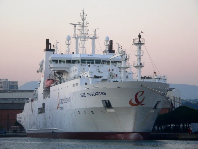
About 95% of intercontinental data travels through submarine cables. Not satellites, not microwave relays. Physical cables on the ocean floor, some of them thinner than a garden hose. When one gets cut by a ship anchor, an earthquake, or military action, the rerouting happens so fast that most people never notice. But when several cables fail at once in the same chokepoint, entire countries can lose connectivity. I wanted to build something that made this infrastructure visible and let you break it yourself.

Severed is a client-side simulator built on real data. You click directly on a cable to sever it and watch the path split apart visually. Or you select one of ten historical scenarios and watch what happens when an entire region goes dark. You can also place arbitrary point cuts anywhere on the map. The app computes which of the 930 metro areas in the graph lose bandwidth, by how much, through which cables traffic reroutes, and whether any cities end up completely isolated. Everything runs in the browser. There is no backend.
The graph model
The network is modeled as a weighted graph \(G = (V, E, w)\) where vertices are metro areas (not countries, because a country like the United States has dozens of independent landing points) and edges are either submarine cable segments or terrestrial backbone links. The weight function \(w : E \to \mathbb{R}^+\) assigns each edge a capacity in terabits per second. Cable data comes from TeleGeography's Submarine Cable Map, which tracks 594 operational cables with their GeoJSON routes and landing stations. Each cable is split into segments connecting pairs of metros.
The capacity numbers are the trickiest part of the dataset. Some cables have publicly reported design capacity from FCC filings or press releases. Most don't. For those, the simulator uses an estimation heuristic based on the cable's ready-for-service year and fiber pair count: newer cables carry more data per pair because wavelength-division multiplexing density has grown roughly exponentially since the early 2000s. Every capacity figure has a confidence tag (verified, estimated, or approximated) so you can see which numbers are solid and which are educated guesses.
Submarine cables alone don't tell the full story. Traffic between Frankfurt and Paris goes overland, not through a submarine cable. So the graph also includes 151 hand-researched terrestrial backbone edges connecting major metros across the same landmass. The full graph has \(|V| = 930\) metro vertices, 92 designated hub vertices \(H \subset V\), and roughly 1,500 edges.
Bottleneck shortest paths
The question the simulator answers is: for each metro, how much total bandwidth can it reach across the global internet? The exact answer requires solving an all-pairs max-flow problem, which is computationally prohibitive at this scale (\(O(|V|^2)\) flow computations, each at least \(O(|V| \cdot |E|)\)). Instead, the engine uses a bottleneck path approximation.
For a path \(P = (v_0, v_1, \ldots, v_k)\) in the graph, the bottleneck bandwidth is the minimum edge weight along the path:
\[B(P) = \min_{i=0}^{k-1} w(v_i, v_{i+1})\]
The engine runs a modified Dijkstra's algorithm from each of the 92 hub metros, using \(\max\) instead of \(\min\) for path relaxation (maximizing the bottleneck rather than minimizing distance). For each metro \(v\), the aggregate connectivity score is:
\[\operatorname{score}(v) = \sum_{h \in H} B^*(v, h)\]where \(B^*(v, h)\) is the maximum bottleneck bandwidth over all paths from \(v\) to hub \(h\). This runs in \(O(|H| \cdot (|V| + |E|) \log |V|)\) using a max-heap, completing in under 200 milliseconds for the full graph.
When you cut a cable, the engine removes the affected edges from \(G\), recomputes \(\operatorname{score}(v)\) for all metros, and diffs against the pre-cut baseline. For a chokepoint cut (like the Red Sea), the engine checks which cable segments have endpoints or midpoints inside a predefined polygon. For a point cut, it finds all segments within a configurable radius. Per-metro output includes the bandwidth loss ratio \(1 - \operatorname{score}'(v)/\operatorname{score}(v)\), path diversity (number of distinct hub-reaching paths), and the top rerouting edges that absorbed redistributed traffic. The simulation runs in a Web Worker so the globe stays interactive.
Validation against real events
A simulation is only useful if it matches reality. All ten built-in scenarios are reconstructions of actual cable failures. The 2024 Red Sea Houthi attacks damaged multiple cables serving the Middle East and East Africa. The simulator correctly shows major bandwidth loss in the WANA region while East Africa remains resilient due to diverse routing around the Cape of Good Hope. The 2024 Baltic Sea sabotage cut two cables, but the region has so much redundancy that the simulated impact is near zero, which matches the real outcome. The 2022 Tonga eruption severed the single cable connecting the island nation, producing total isolation in the model and in reality. The 2011 Tohoku earthquake damaged cables off Japan's Pacific coast. Other scenarios cover the 2006 Luzon Strait earthquake, 2023 Vietnam cable failures, 2024 East Africa cuts, and 2022 Egyptian landing damage.
The most informative test case is the 2008 Mediterranean cable cuts, where multiple failures near Alexandria caused Egypt to lose about 70% of its bandwidth and India about 60%. The simulator's numbers land in the right ballpark. Not exact, because real-world rerouting depends on peering agreements and traffic engineering that the model doesn't capture, but close enough to be directionally useful.
What you find when you start cutting
The interesting part isn't any individual scenario. It's the patterns that emerge when you spend time clicking around the map. Some findings that surprised me: the Luzon Strait between Taiwan and the Philippines is far more consequential than most people realize. A handful of cables through that corridor carry the majority of traffic between East Asia and the rest of the world. Cut them and Japan, South Korea, and Taiwan all take significant hits. Meanwhile, Western Europe is almost impossible to isolate. The number of cables landing in the UK, France, Spain, and Portugal from different directions creates enough redundancy that you have to cut dozens of cables simultaneously to meaningfully degrade service.
Small island nations are fragile in ways that are obvious in retrospect but easy to overlook. Tonga, Tuvalu, and several Pacific islands depend on a single cable. One anchor drag and they go dark. West Africa is somewhere in between: there's growing cable diversity, but a cluster of failures at the right chokepoint can cascade because the terrestrial alternatives are limited.
Rendering the globe
The visualization uses Deck.gl on top of MapLibre GL with a CARTO Dark Matter basemap, which is free and requires no API key. Cables render as arcs with width scaled by capacity, colored on a blue gradient by tier. Cut cables turn red. Metro nodes change color based on impact: green for unaffected, yellow for degraded, orange for heavy loss, red for isolated. The impact panel on the right ranks affected metros in a scrollable list with per-metro bandwidth bars and latency deltas.
State management is Zustand, the UI is React 19 with Tailwind CSS 4, and the build is Vite. The whole thing deploys as static files to GitHub Pages. No accounts, no backend, no API keys.