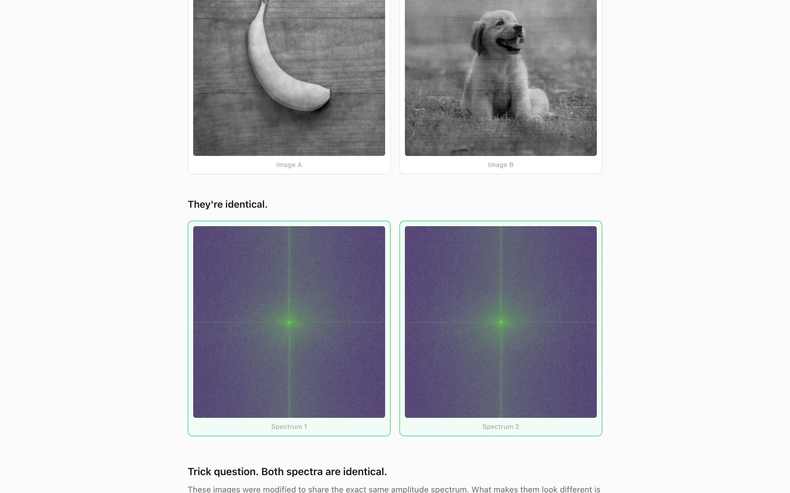
Take the 2D discrete Fourier transform of an image and every coefficient is a complex number: an amplitude saying how strong that spatial frequency is, and a phase saying where it sits. I wanted to see for myself which of the two carries what the image looks like, and it's almost all phase. This app takes two images you upload, pushes them toward one shared amplitude spectrum, and shows that they still look like themselves.
The iteration
Both images are converted to gray with the BT.601 weights (0.299, 0.587, 0.114) and resized to the same power of two, at most 512, because the radix-2 FFT in fft.js needs it. The 2D transform,
\[F[u, v] = \sum_{x=0}^{N-1} \sum_{y=0}^{N-1} f[x, y] \, e^{-i2\pi(ux + vy)/N},\]separates into a 1D FFT on every row and then on every column. Then 200 rounds of the following. Transform both images. Split each spectrum into amplitude \(|F|\) and phase \(\varphi = \operatorname{atan2}(b, a)\). Replace both amplitudes with their mean,
\[A[u,v] = \tfrac{1}{2}\bigl(|F_A[u,v]| + |F_B[u,v]|\bigr),\]which is the exact projection onto the set of spectrum pairs with equal amplitude. Recombine \(A\) with each image's own phase, inverse transform, and blend the result with the original image,
\[f^{(t+1)} = \operatorname{clip}\bigl(\beta_t f^{(0)} + (1 - \beta_t)\,\tilde f^{(t)},\; [0, 255]\bigr), \qquad \beta_t = 0.8\,e^{-4t/200}.\]At the first step \(\beta\) is 0.8 and the images barely move. By the last step it is 0.015, so the final image is 98.5 percent projection and 1.5 percent original. The shape is borrowed from Gerchberg-Saxton, alternating between a constraint in the frequency domain and one in the image domain, except my image-domain constraint is "stay near the original" rather than a known amplitude. I picked the decay schedule by eye, and since the constraint sets aren't convex nothing guarantees it converges. The two final spectra come out nearly but not exactly equal, because the blend and the clip both move the amplitude a little after the projection.
Why phase wins
Oppenheim and Lim showed in 1981 that an image rebuilt from its phase alone, with flat amplitude, stays recognizable, while one rebuilt from its amplitude with random phase is noise (The importance of phase in signals, Proc. IEEE 69(5), 529 to 541). An edge is many frequencies agreeing on where to peak. Scramble the phase and the agreement is gone, and the energy smears across the frame. Amplitude mostly encodes how energy falls off with frequency, roughly \(1/f\) for natural photographs, and a banana and a dog have roughly the same curve. So averaging two natural amplitude spectra is a small change to either image, while phase, the thing that differs, is only touched indirectly through the blend and the clip.
The reveal
The 200 iterations run in a Web Worker, passing the Float64Arrays back as transferable objects so nothing is copied. Then the app shows the two modified images, shows two amplitude spectra, and asks which one belongs to image A. Whichever you click, it tells you the spectra are the same and shows the phase plots underneath. Spectra are shifted so DC sits in the center, plotted as \(\log(1 + |F|)\) because DC is orders of magnitude above everything else, and colored with viridis. Phase wraps at \(\pm\pi\), so it gets a circular colormap built from phase-shifted sines.